“This Friend is Mine” is a children’s picture book designed for ages 4–7. The story follows two friends, both from different worlds, shapes, and sizes, and their journey of becoming friends, despite their difference.
Creative Direction
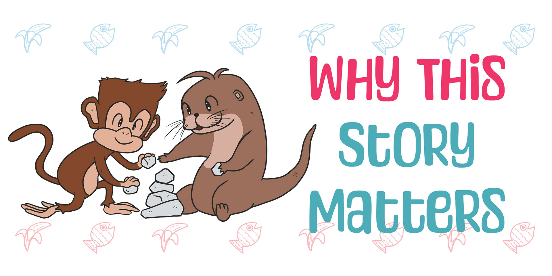
The visual direction I’ve aimed for is friendly and welcoming that supports any kind of reading environment. I wanted the characters’ stories to be told through their expression. As the setting is in one place, their expressiveness, fun, and goofiness carry their journey through.
Visual Language
For the color palette, I’ve researched what is used for spring. These colors may represent the months of April and May, a time when spring begins to bloom, and animals come out of hibernation. The colors also coincide with the expression that both Momo and Otto are giving.
Process & Iteration
Their expressions can vary from their faces to their body language. All elements from colors, body language, and expression, all play a cohesive role together to form key moments for what Momo and Otto are telling the readers.
Early sketches depicted different variations of Momo and Otto. I’ve leaned on other examples of monkeys and otter characters represented in other children’s media to build a solid visual of what their final vision will be.
Final Outcome
The final outcome supports easy reading and warm illustrations with white space that helps the reader hone in on the characters' interactions through their wild antics, expressive behaviors, and their warming friendship.
Early Concepts and Storyboards
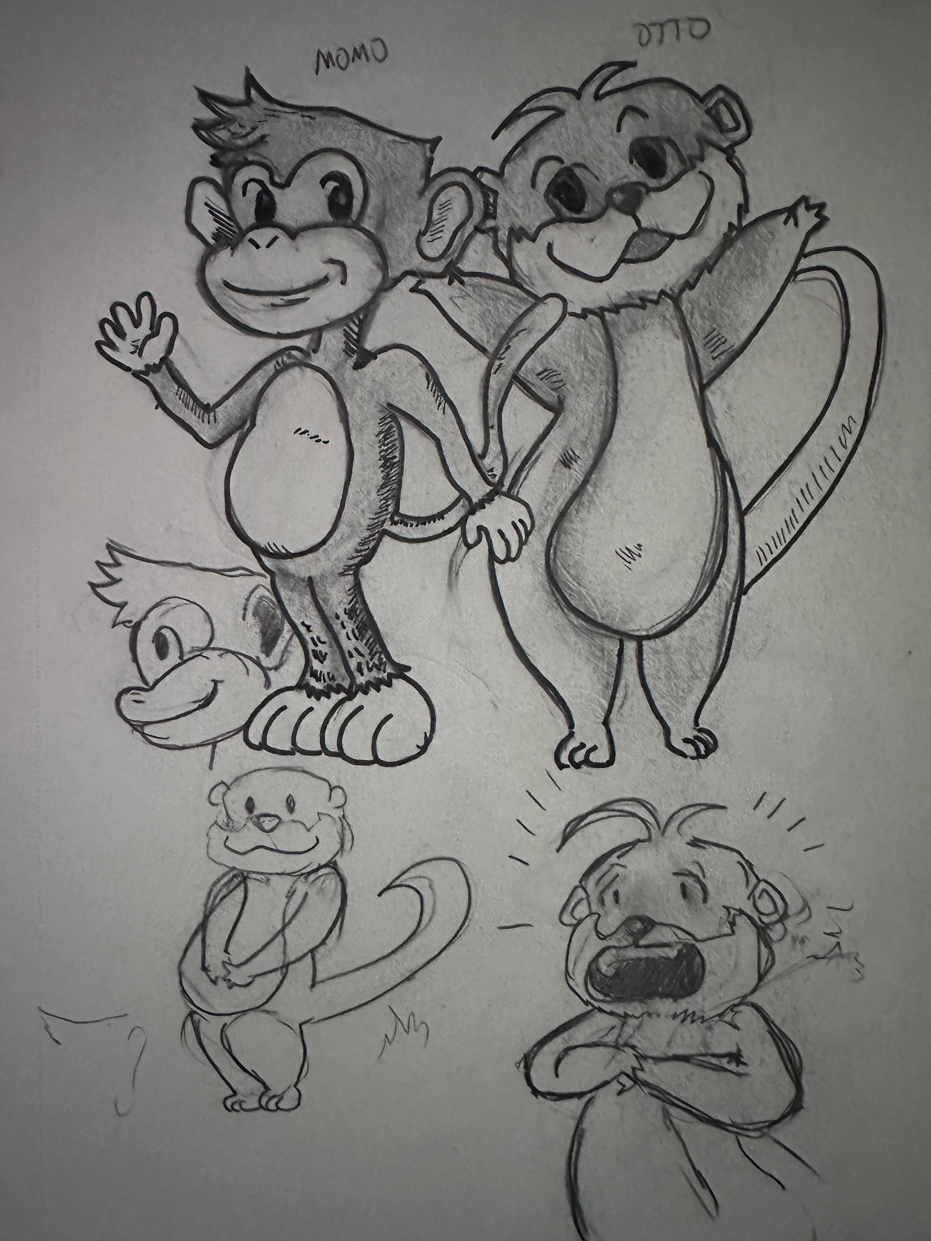
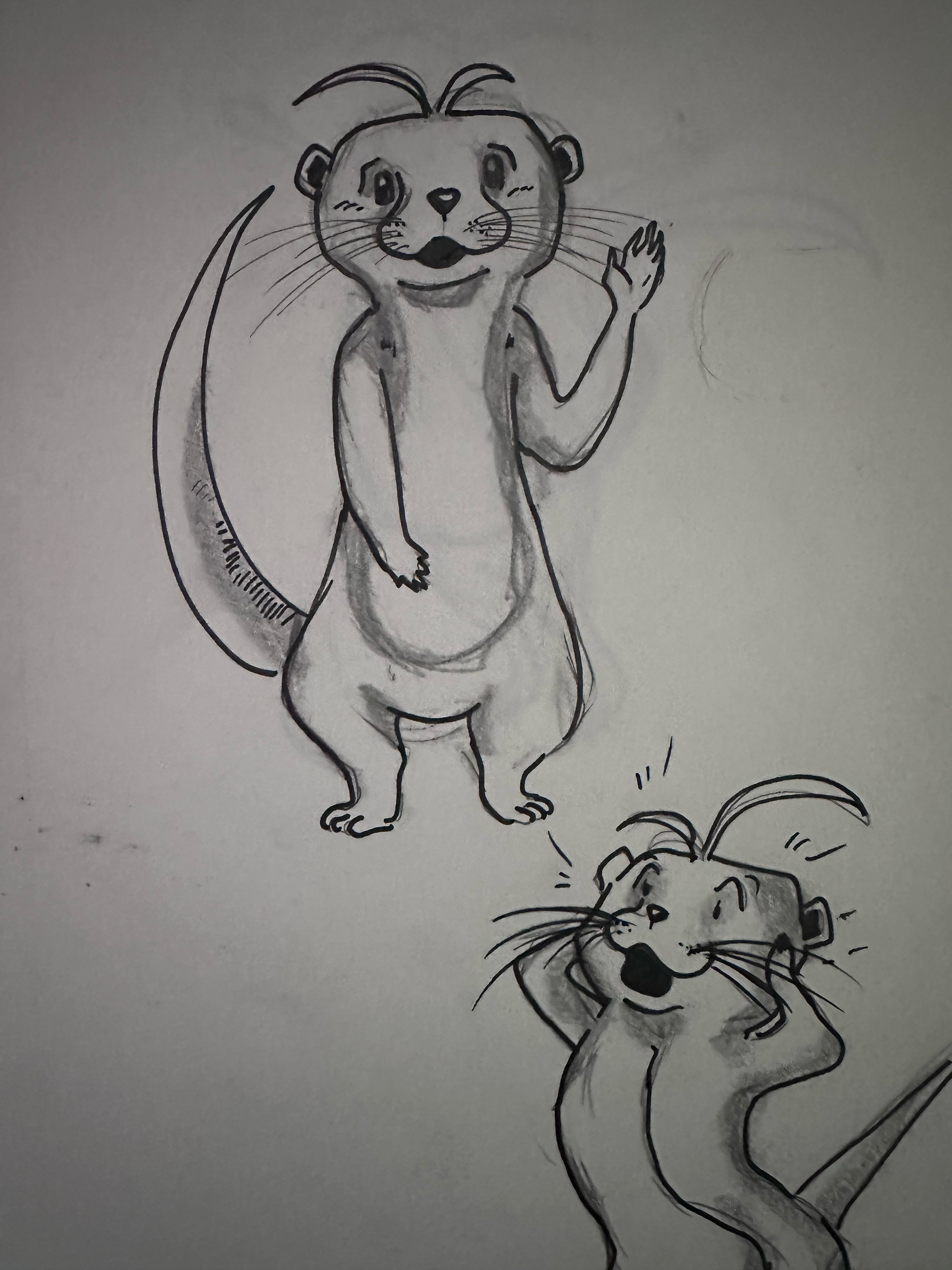
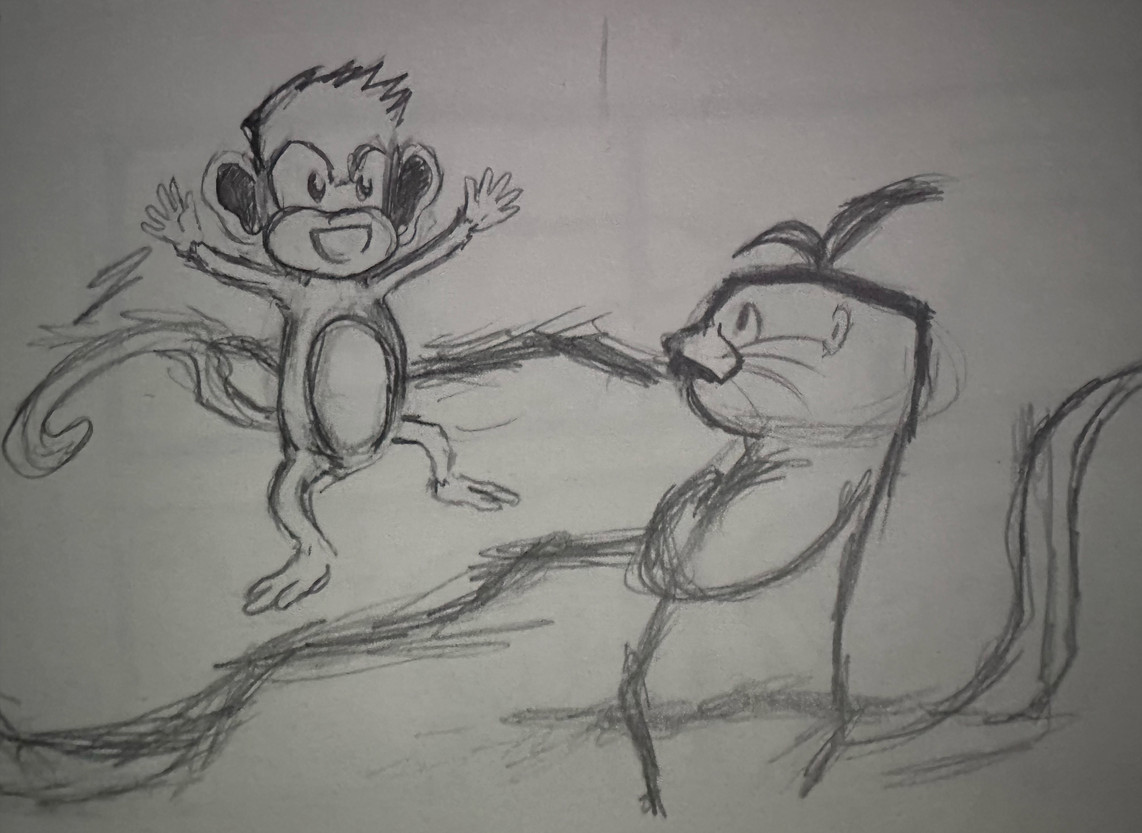
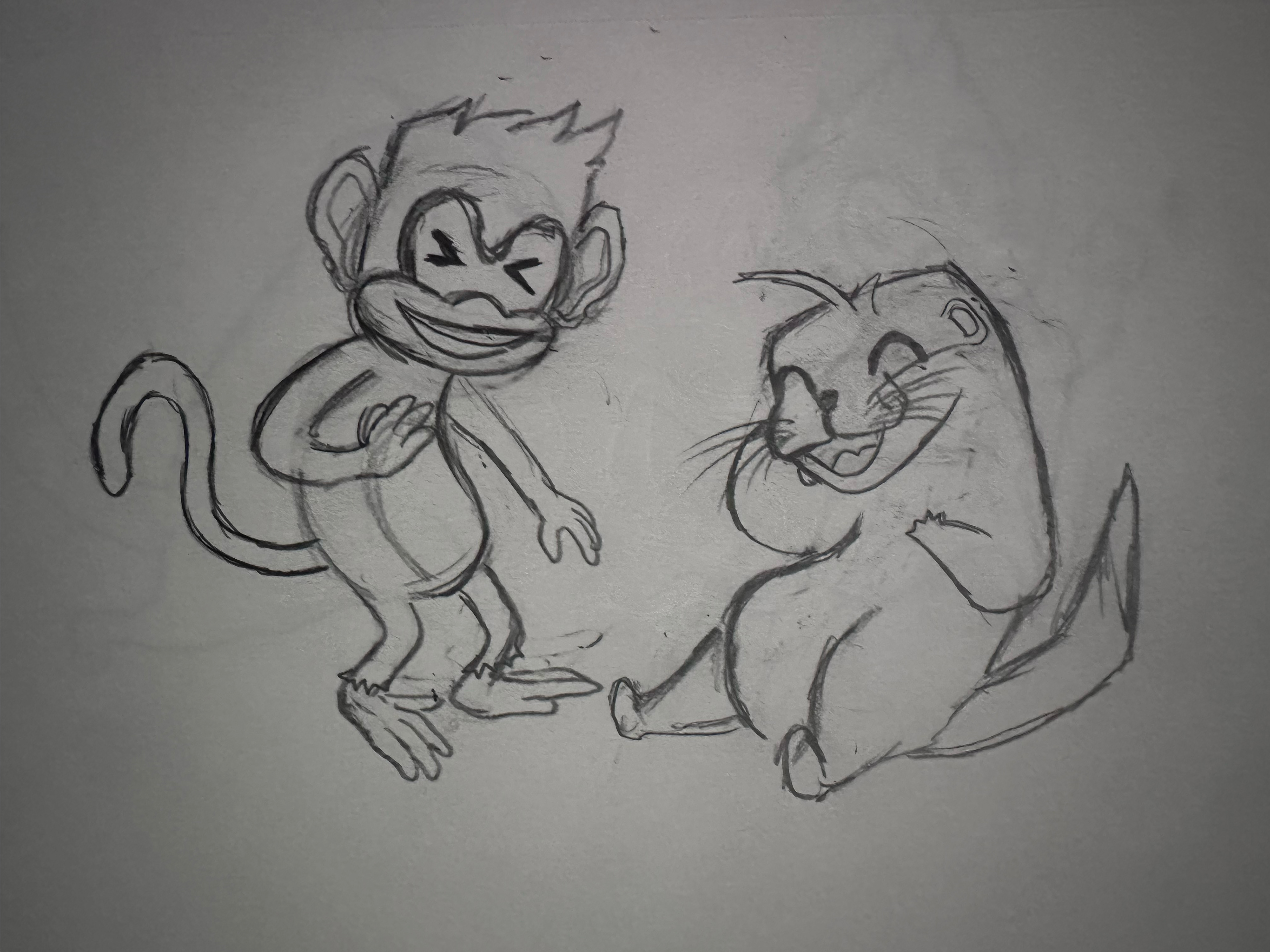
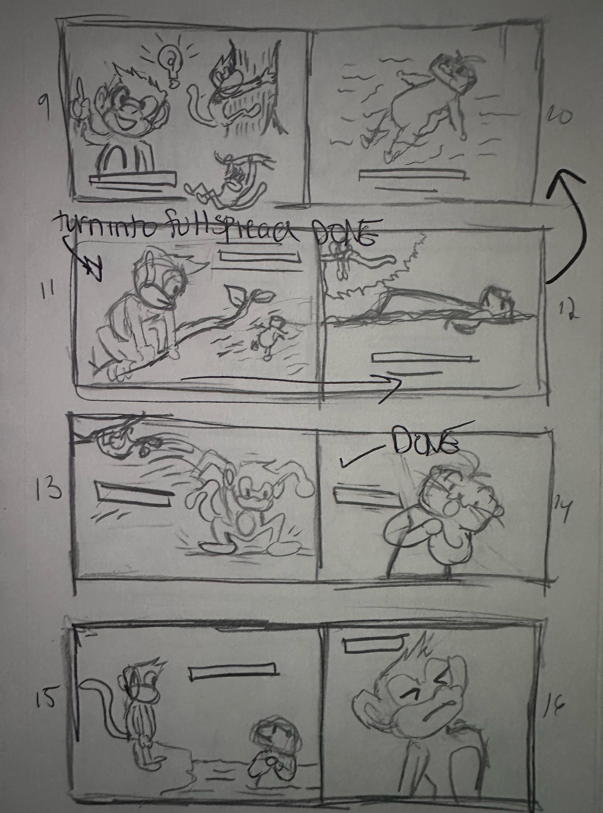
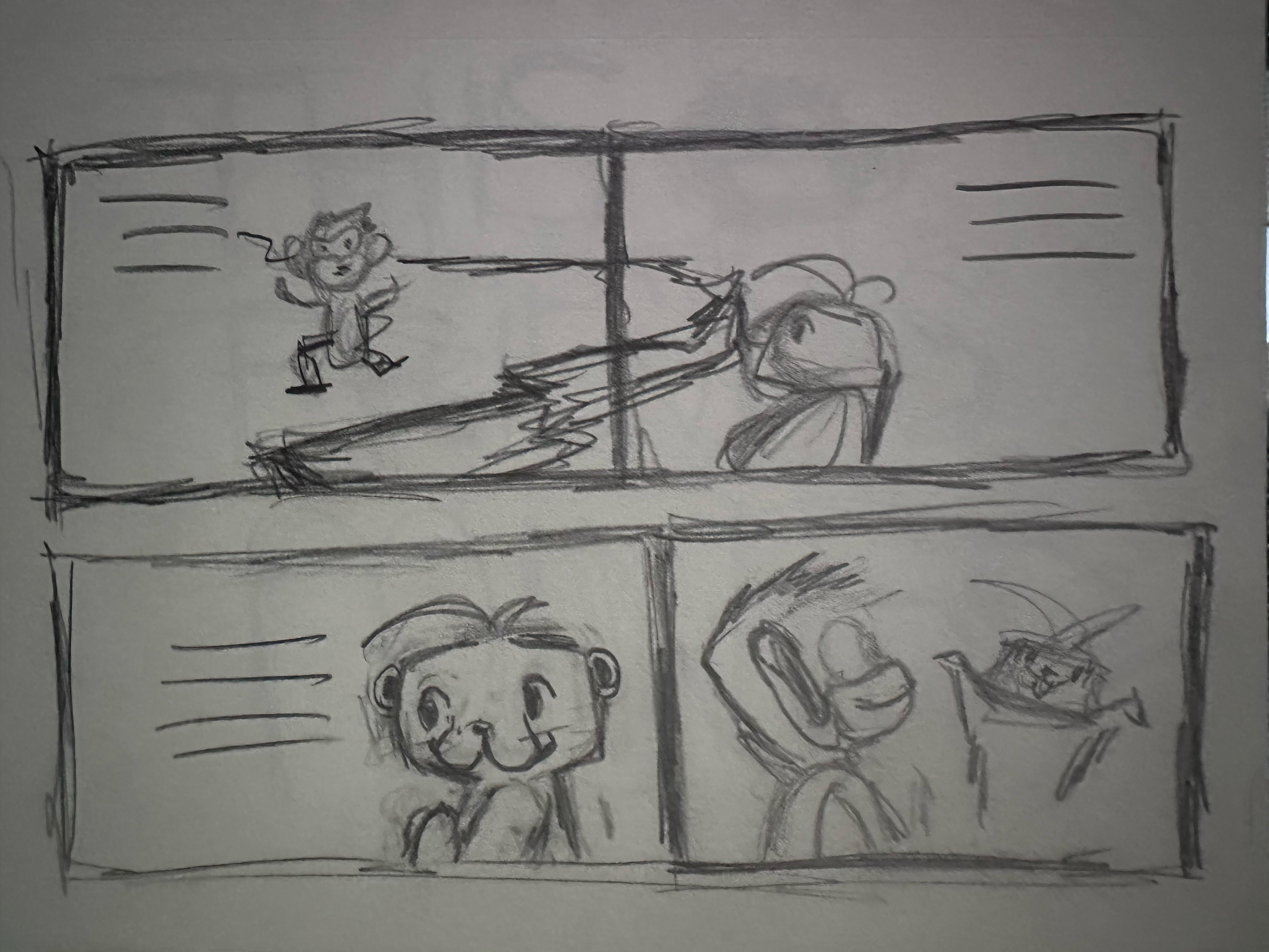
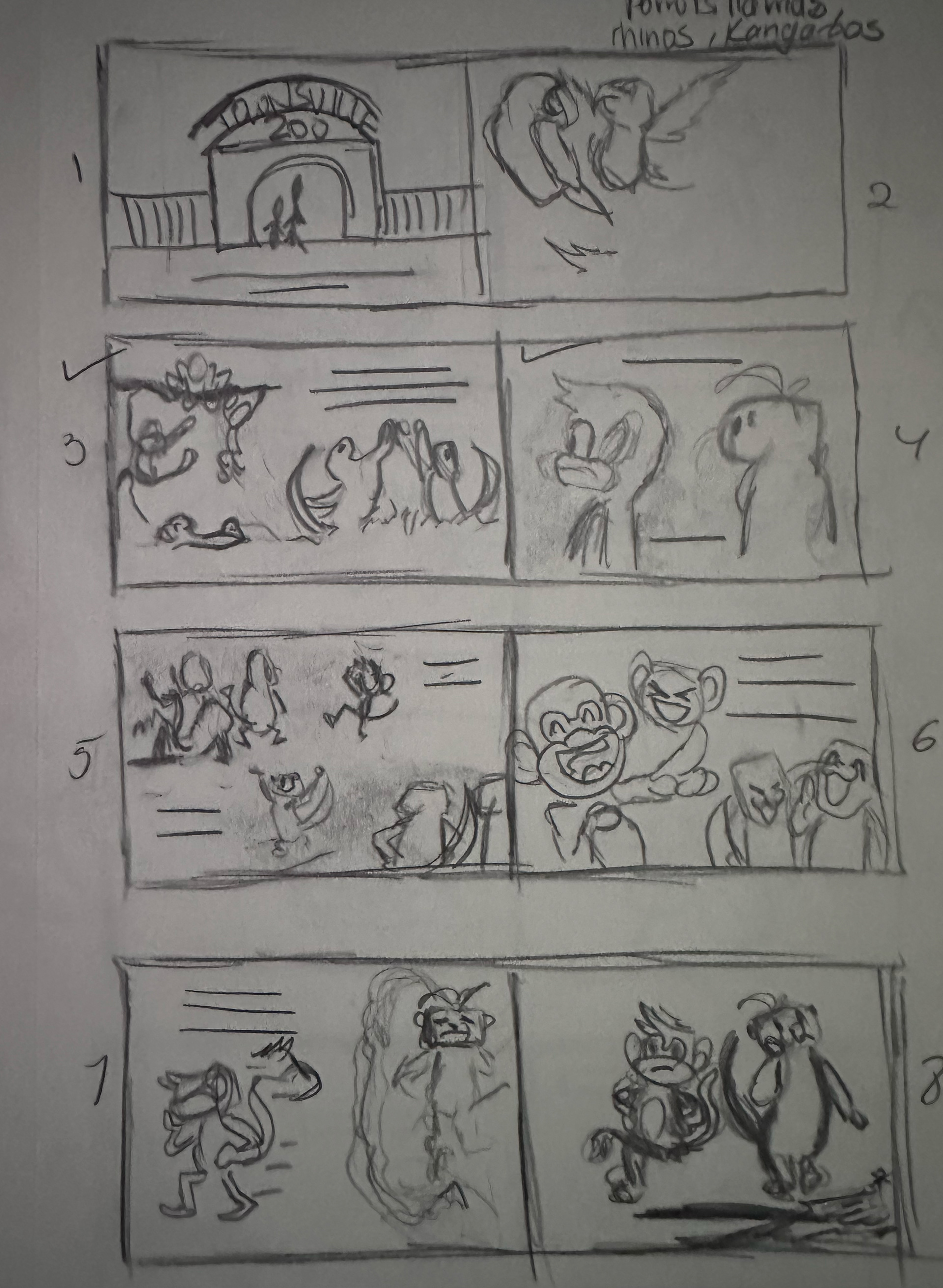
Early concepts of what the characters will look like. Multiple drawing phases were taken to get the exact visual of what the client envisions his characters will look like to his readers.
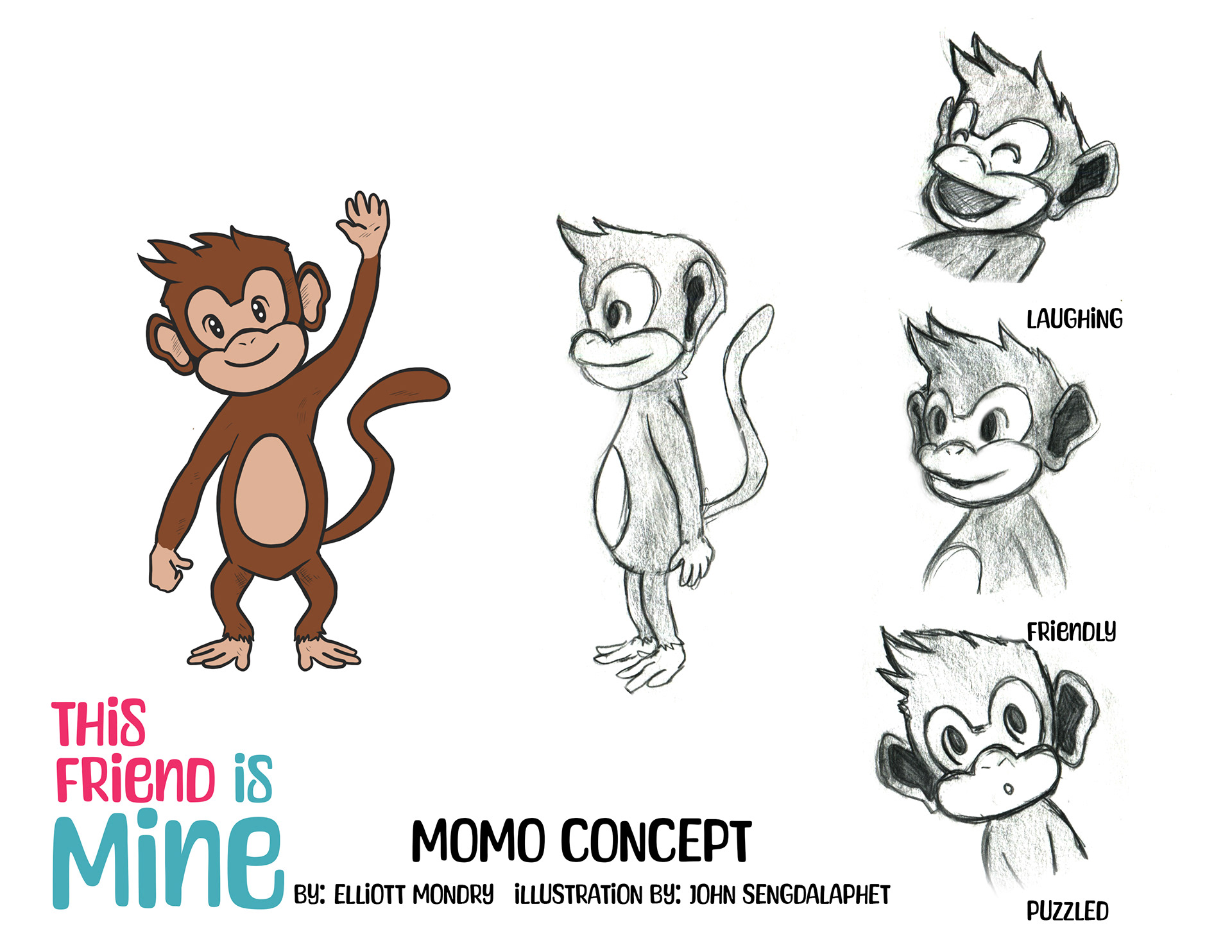
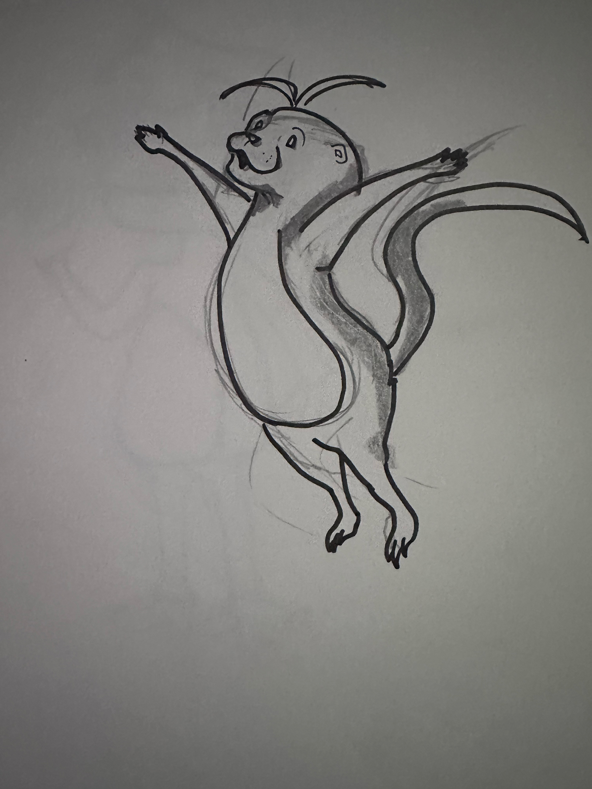
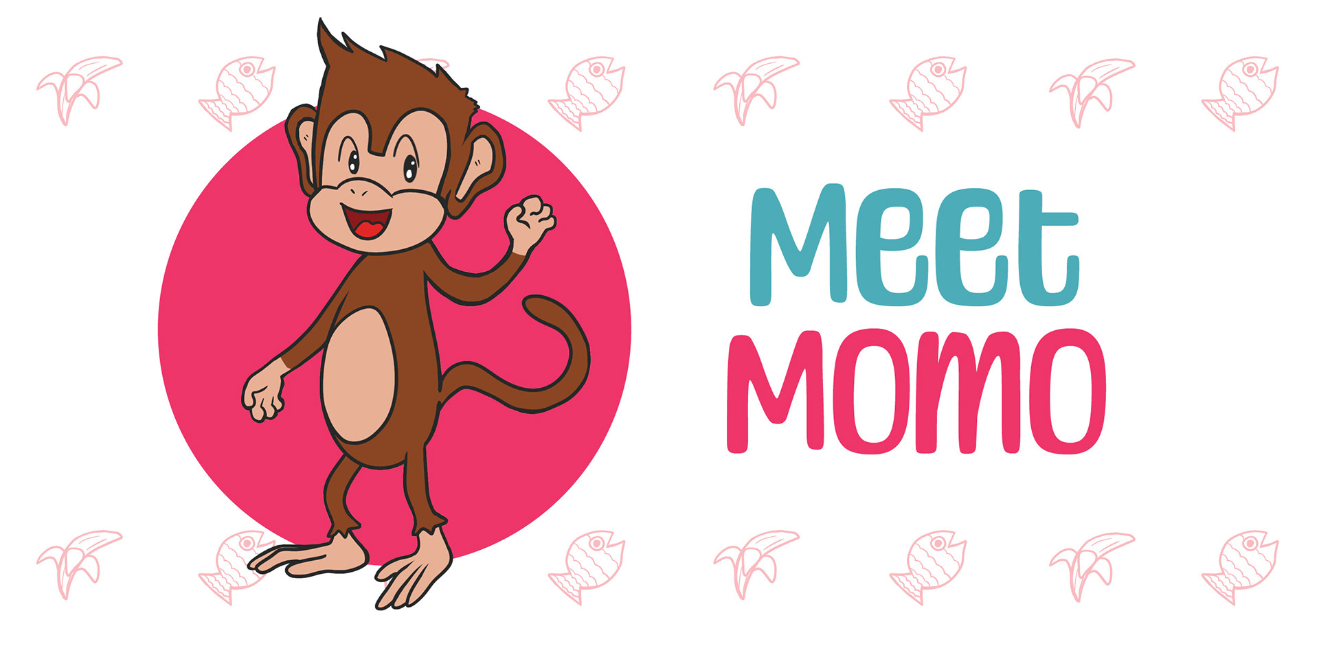
In earlier designs, I drew Momo with five fingers and realized that throughout the project, he was depicted with either five fingers or four. In the end, I proceed with Momo having four fingers, which is reflected throughout all pages depicting him.
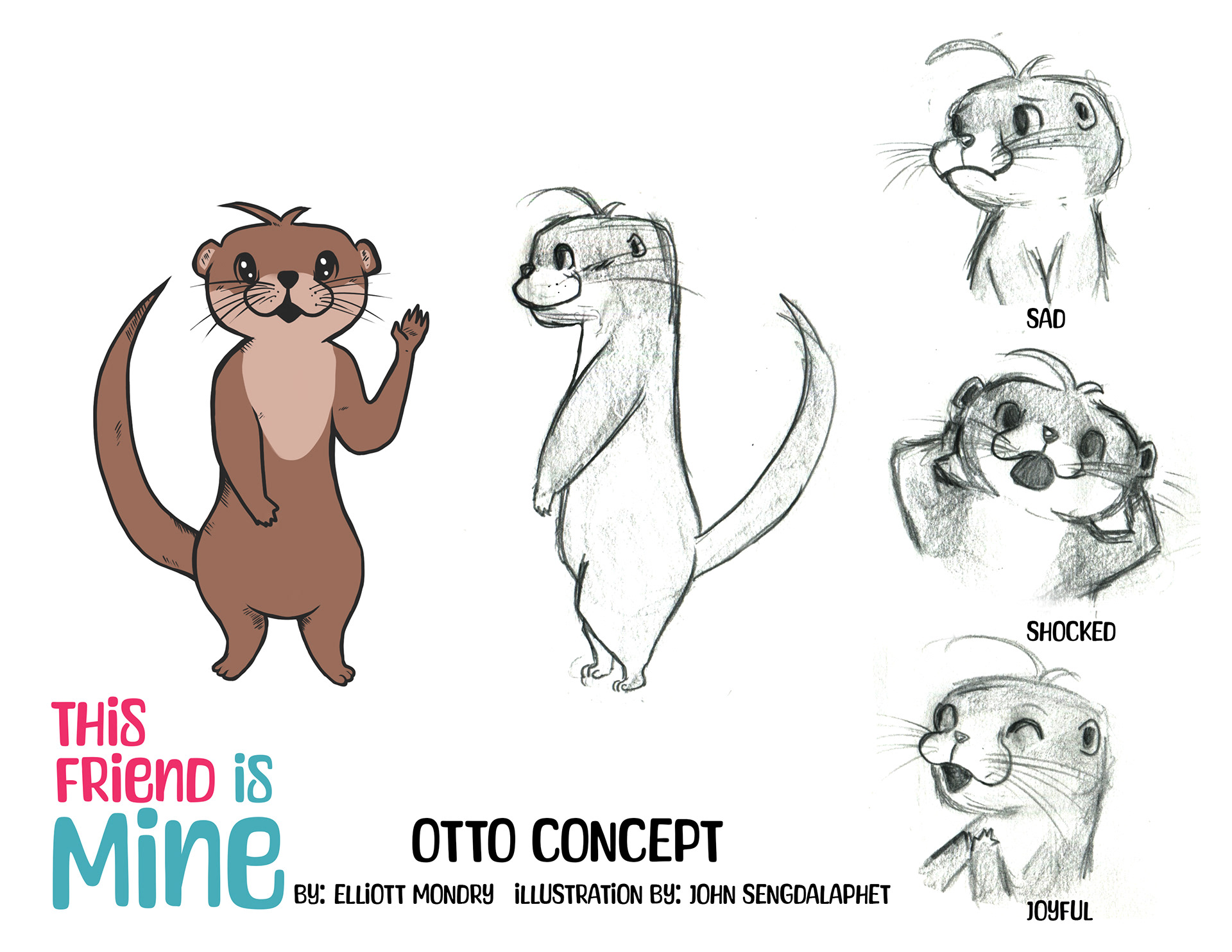
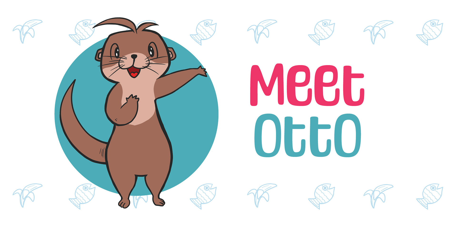
I've started with five fingers for Otto as well. However, I was actually consistent with him and didn't forget about it, unlike with Momo. Otto was also lankier in earlier designs. He almost went through, but it was finally that he didn't fit the appearance meant for a younger audience. Instead, I proceeded to draw him more bubbly and smaller, warm and friendly enough to appeal to the audience the book was made for.
Challenges of designing characters include keeping the appearance of the characters consistent. I'll admit that while Momo was easy to maintain, Otto was very challenging as he is an otter and his body visuals were alternating between condensed and elongated, depending on what he is doing in the frame. In the end, what I wanted to accomplish is provide a visual of what the characters are doing and to convey the story to the readers with client approval at each step of the way.
Social Media Promotion
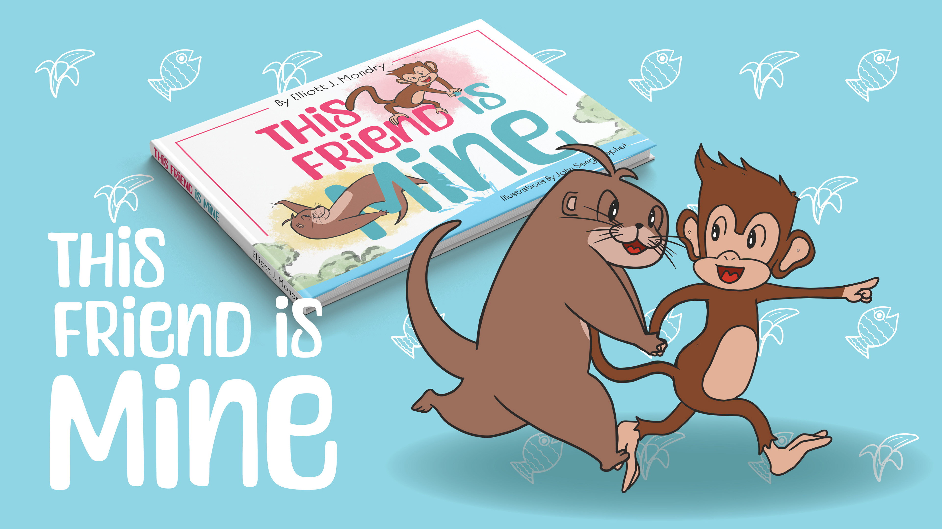
Kickstarter Graphics
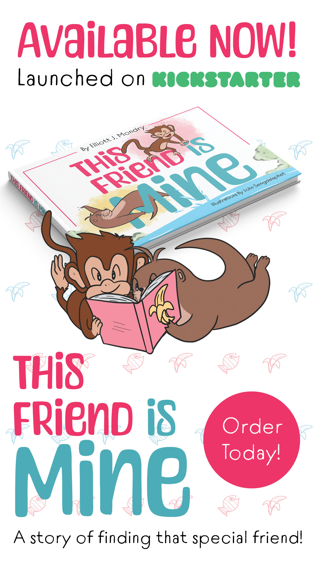
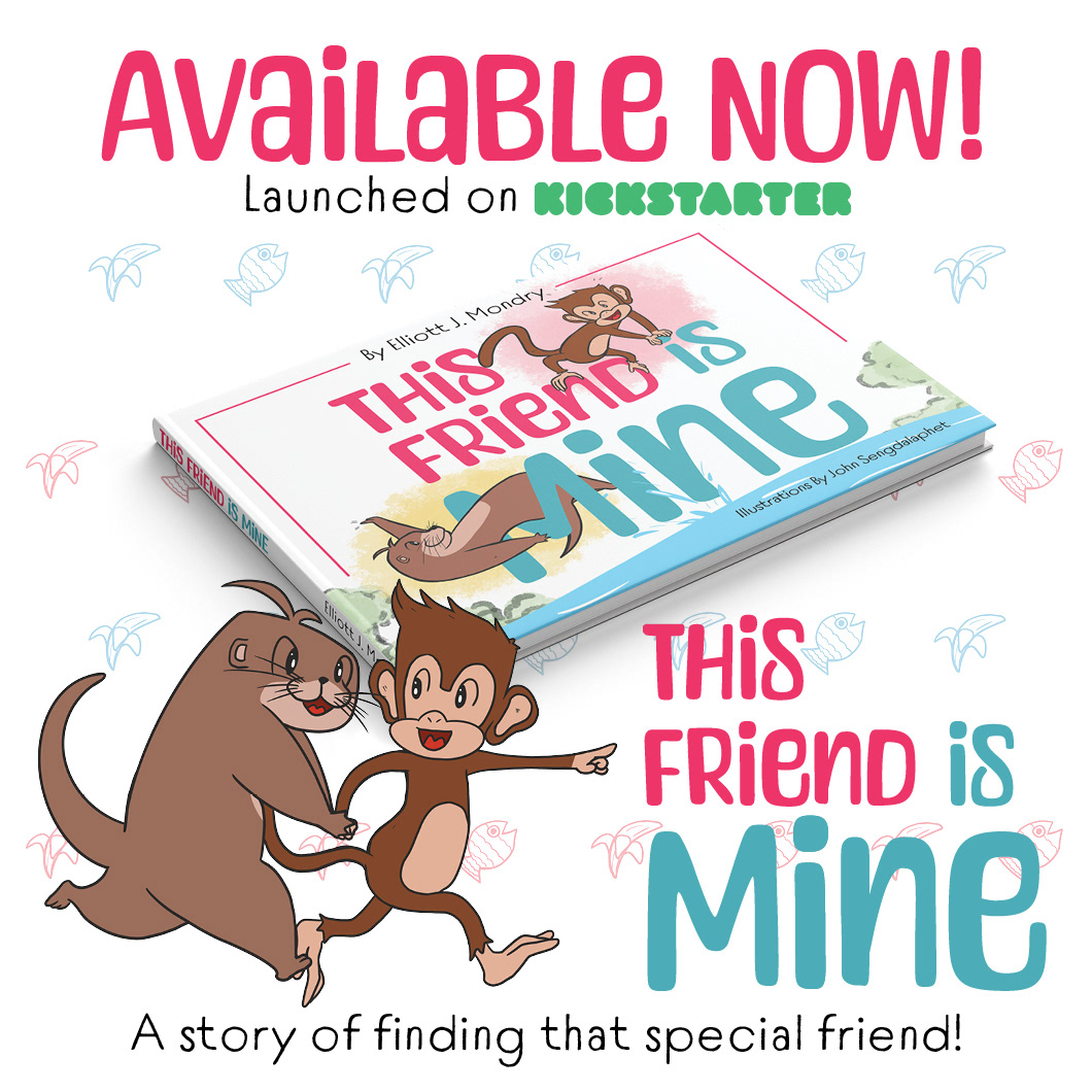
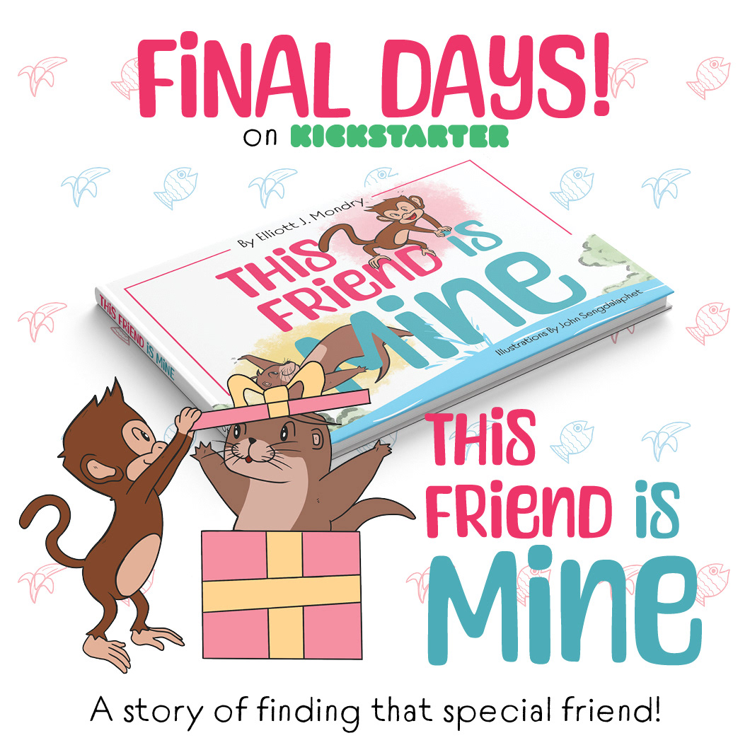
Kickstarter graphics provided for visual promotion to garner potential backers to support the project. Graphics were also used for future promos, including instagram promos and print promos.
Check it out here:
https://www.kickstarter.com/projects/elliottmondry/this-friend-is-mine
Instagram Promo
Print Products
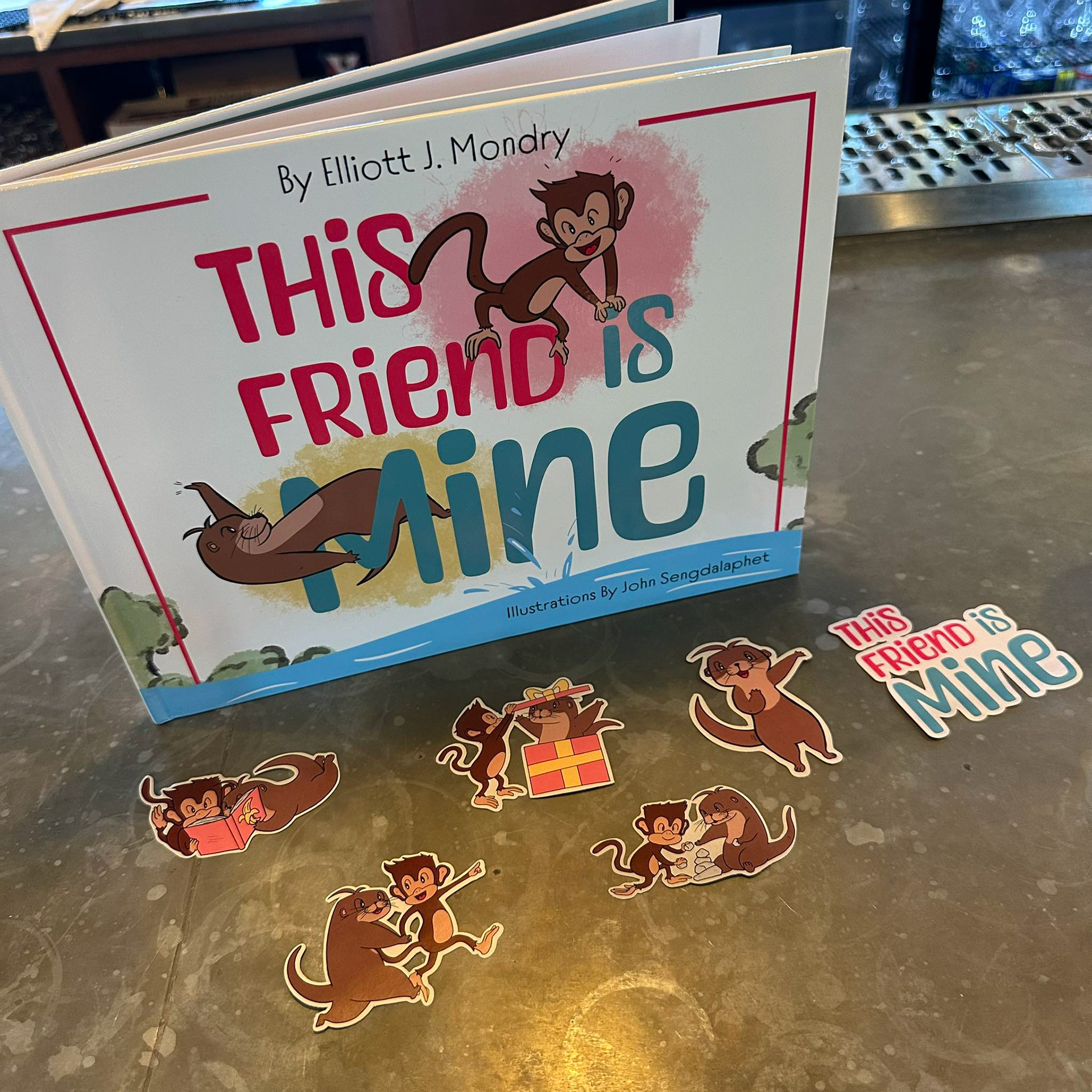
Stickers for Print
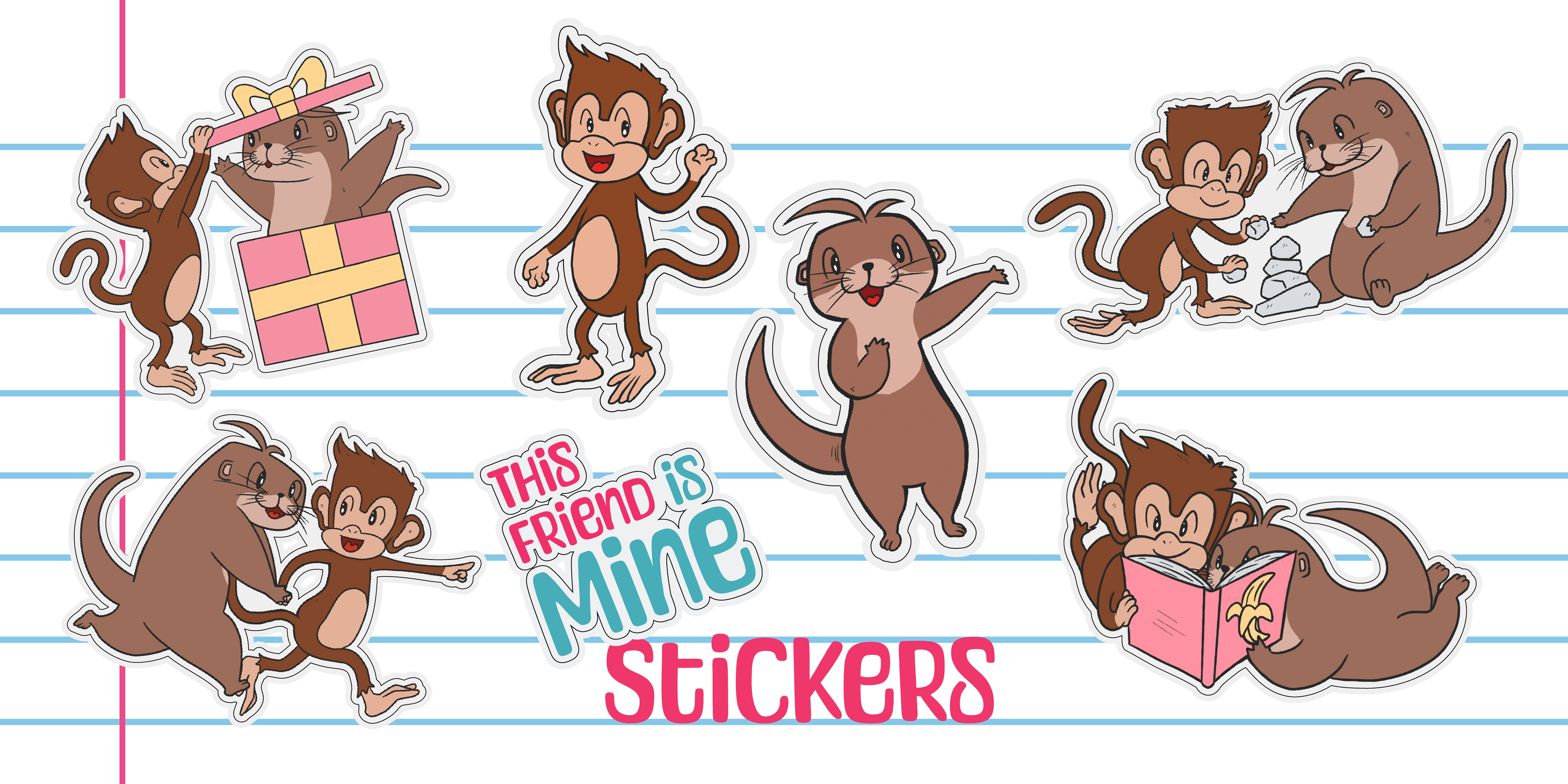
Finalization of product including stickers for those who backed up the Kickstarter project.
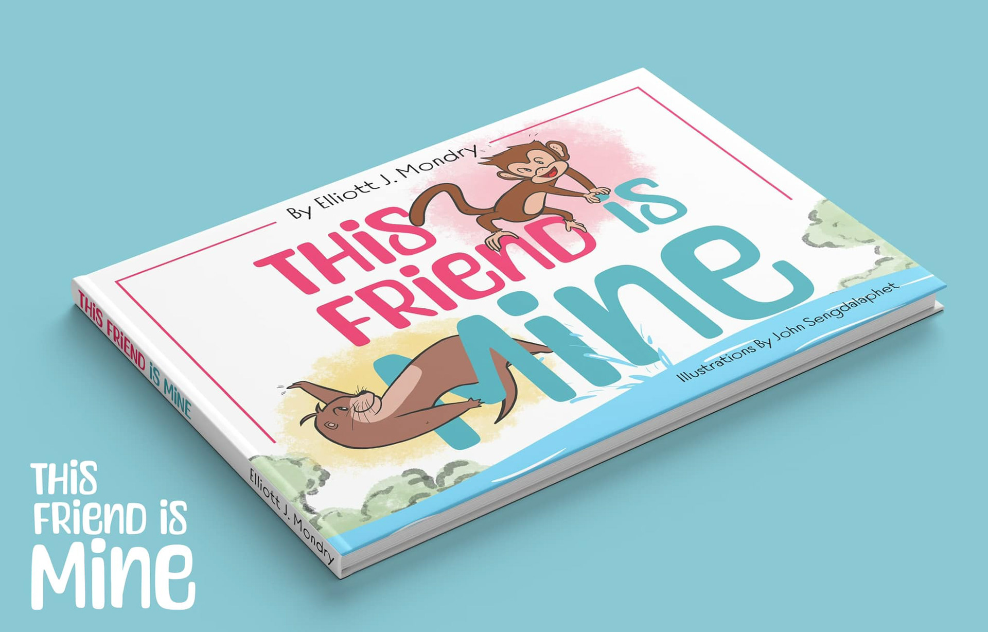
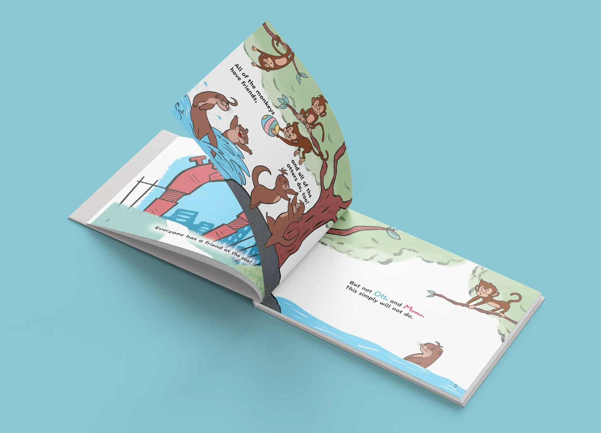
Cover design and inside sample pages
Final Product